DAX measure basics in Power BI or Excel data model
After speaking with Rob Collie and Thomas LaRock on the Raw Data with P3 Adaptive podcast this week, I decided to share my decidedly old school tips for learning DAX. 1. Learn about filter context; 2. use variables to debug measures, and 3. understand how CALCULATE works. At the end, I link two of my blog posts: one which applies the concepts of coordinates and values to the different visualizations available in Power; the other is how to troubleshoot the trickiest visual of them all: the table visual.
Like throwing water on gremlins with/Fred Kaffenberger - Raw Data with P3 Adaptive podcast
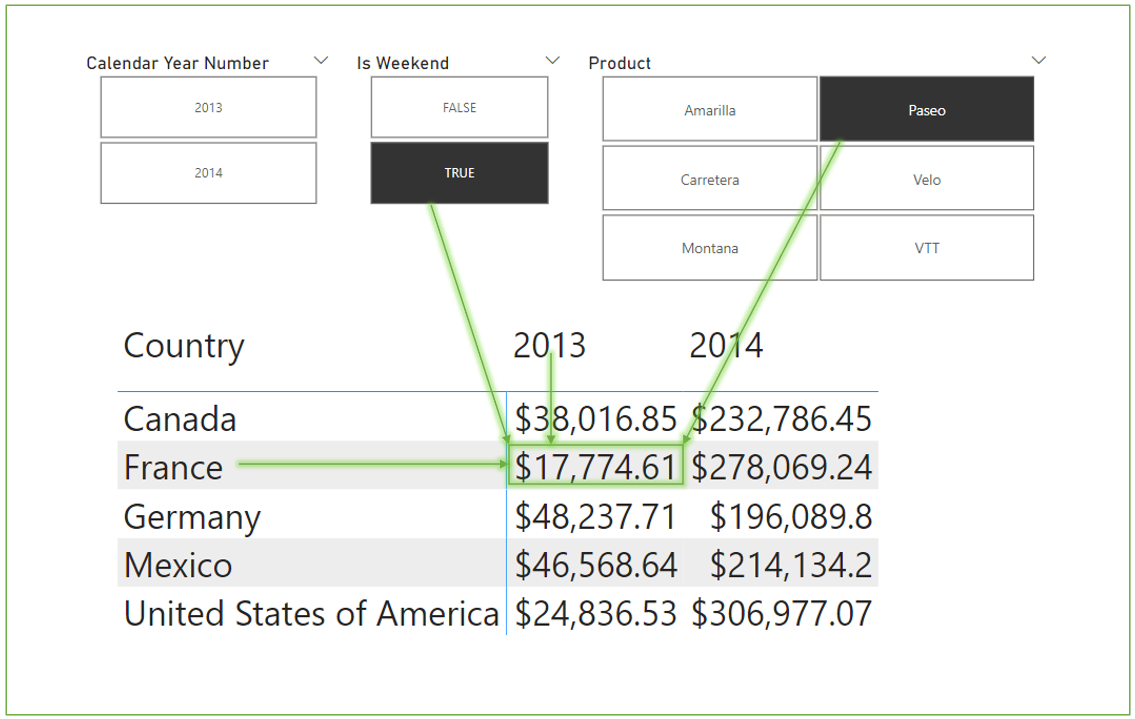
Each cell in a matrix is filtered by row, column, slicers, and the filter pane (not shown).

The funnel icon (invisible until you hover your cursor over the area) shows external filters on the visual. Measures are also filtered by their coordinates in the visualization. $17,774.61 is the value of the cell in the matrix filtered by Year=2013, Country=France but also Weekend=TRUE and Product = Paseo.
1. Filter context
Measures are evaluated in a filter context. That filter context is determined by filter pane, relationships between tables, and the coordinates of a visual (rows and columns in a matrix for example, but not values).
Here's a video showing how filter context works (Rob Collie refers to Power Pivot, which is the data model in Excel):
SQLBI (Russo & Ferrari) also have an article on filter context. They tell you to read about row context first but that ONLY applies to calculated columns.
https://www.sqlbi.com/articles/filter-context-in-dax/
2. Use variables to troubleshoot your DAX (Marco Russo and Patrick of Guy in a Cube):
The basic format for variables is like this:
Measure =
VAR someVariable = 1 // var keyword defines each variable
VAR anotherVar = 2
RETURN // ends variable area
someVariable // formula which gets evaluated.
3. Calculate function (Rob Collie shows the power of CALCULATE function)
Further info on measures in Power BI visuals:
Pivot tables and matrix visuals are straightforward. The following articles do a deeper dive on how Power BI visuals use values and coordinates.